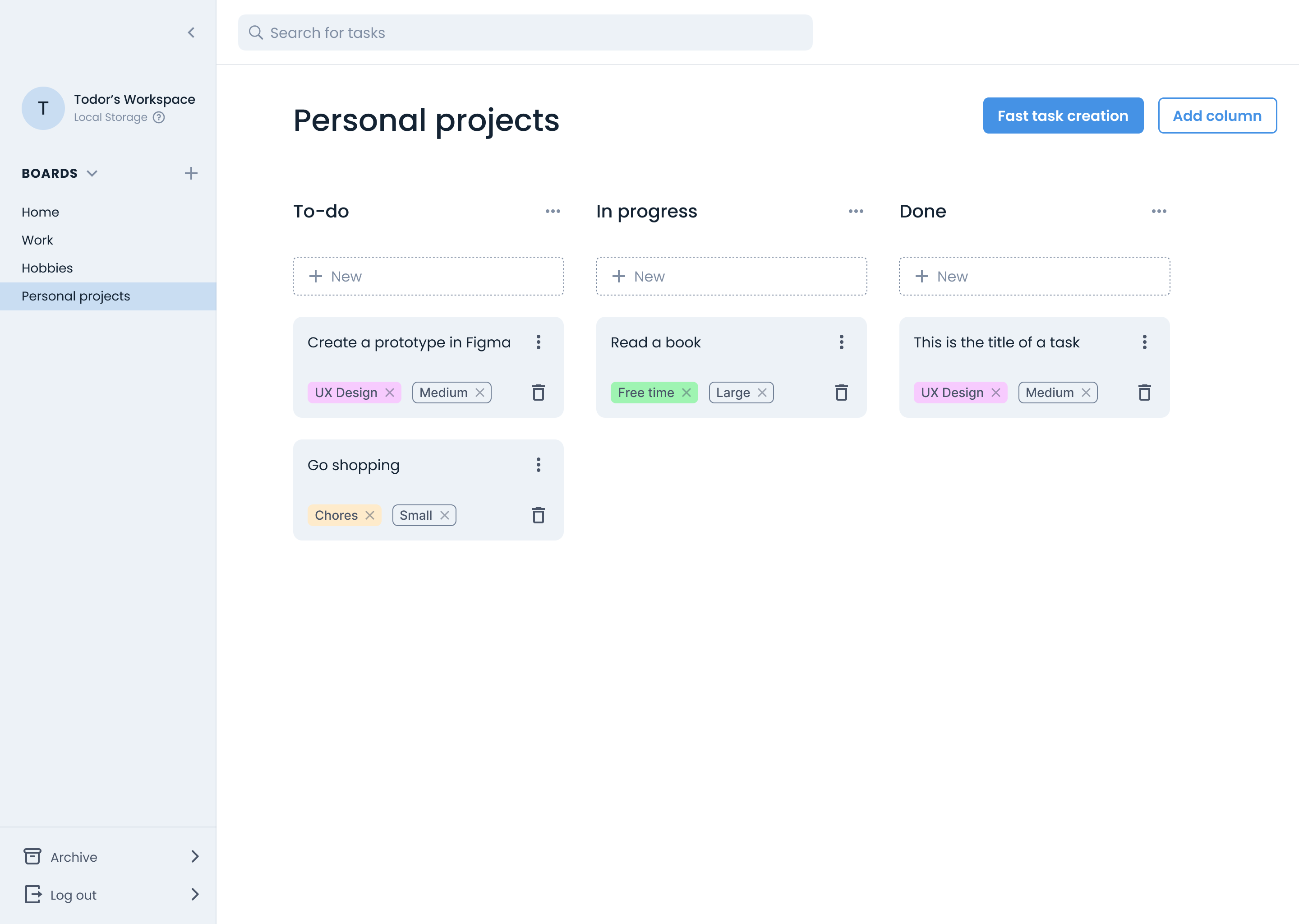
SimpleTasks, at a glance
SimpleTasks is a personal task manager for people who want to organise their own tasks without the complexity of tools built for teams. I designed the product from scratch, working alongside two developers on its flows, interactions and interface.
This case study focuses on the challenge of making bulk task creation understandable: helping people learn the writing format while seeing how their input becomes task cards.
A quick bit of context
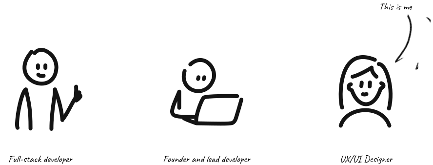
SimpleTasks started with a simple frustration. A developer friend of mine wanted a clean, no-nonsense way to manage his personal tasks - nothing built for teams, nothing bloated with features he'd never use. He decided to build it himself and open-source it so others dealing with the same problem could use it too.
As we worked through the design, one question became worth a closer look: how could we make adding several tasks feel as simple as writing a list?

The problem worth obsessing over
My collaborator’s own experience, his conversations with colleagues, and the Reddit discussions and product reviews I explored pointed to a similar frustration: tools built for complex workflows could feel excessive for simple personal tasks. You open the app with 10 things in your head, and by the time you've filled out the third form - title, size, priority, tags, confirm - you've lost the thread.
This gave us a clear product goal that went beyond "make it look clean": we needed a way for users to offload their entire brain in one sitting, with as little friction as possible.
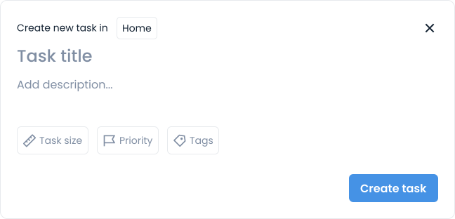
The standard task creation form followed familiar patterns, included only the essentials, and was designed for adding a single task. But it wasn’t built for volume. Adding several tasks meant repeating that flow for each one: open the form, enter the details, create the task, and start again.
So we asked: what would it look like to create 10 tasks at once?
Adding tasks directly to the board
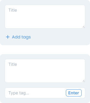
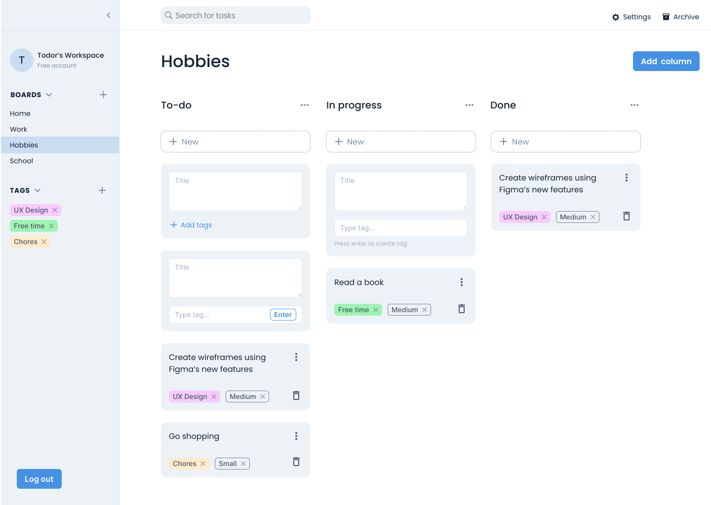
One approach I explored was letting people create tasks directly on the board, without opening a modal. Trello uses a similar approach, but I also included the option to add tags directly to each card.
This removed the step of opening a form, but creating several tasks still meant adding and confirming each card individually. Details such as description and priority would still require a separate window. Including every field on the card would make this supposedly lightweight interaction more crowded.
We wanted to explore a way to capture several tasks together.
The idea that changed the direction
Our lead developer suggested letting people write tasks like they’re jotting down notes, using a bullet-point format to turn a whole list into task cards.
Each top-level bullet would become a task. Sub-bullets would carry optional details: description, size, priority and tags. My job was to make this unfamiliar format understandable and help people see how their writing would translate into task cards.
The design challenge: a blank page is intimidating
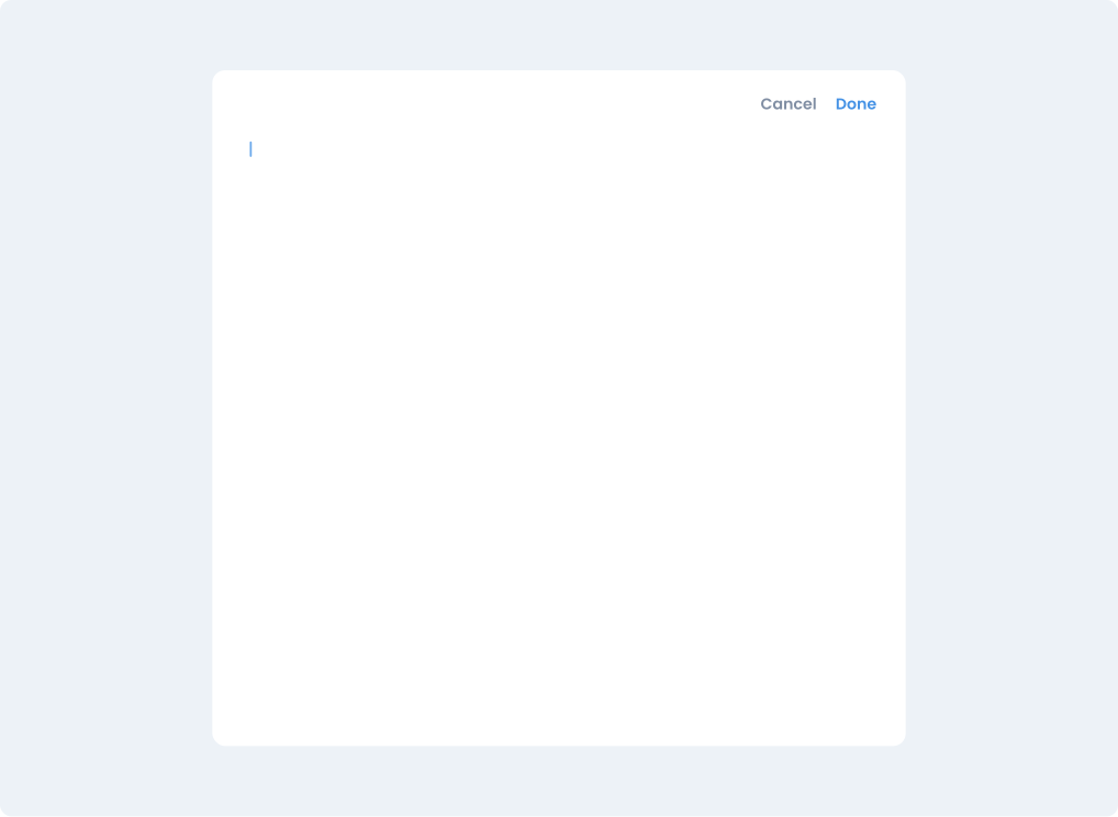
The first draft was a modal with a blank writing area and two buttons. The interface was intentionally minimal, but the writing format wasn’t obvious. How would someone using it for the first time know what to write?
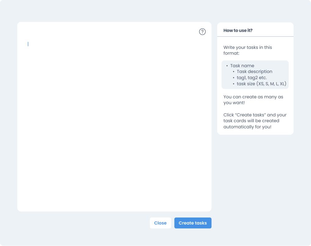
My first approach was to add a help icon in the top-right corner of the modal, opening instructions in a sidebar. This would give people a reference for the writing format while they entered their tasks.
I also designed a live preview panel to show how the written list would become task cards as people typed. Seeing the result alongside their input would give them a way to check the format and spot mistakes before creating their tasks.
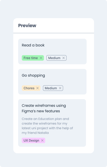
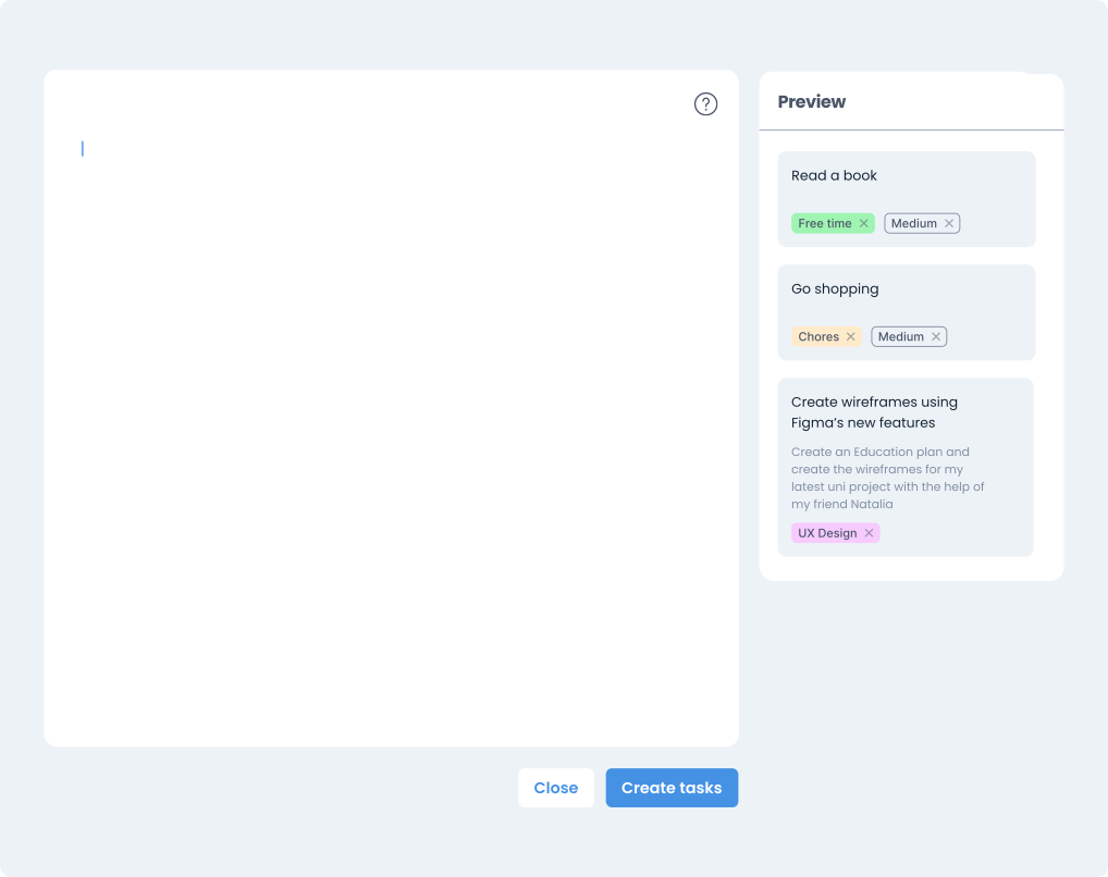
But the instructions and the preview were designed to occupy the same sidebar. People could see one or the other, but not both.
How could someone learning the format keep the instructions visible while still seeing their task cards?
How I resolved it
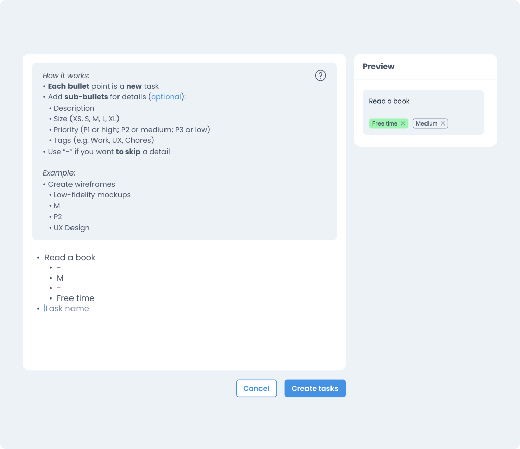
The solution was to make the instructions togglable inside the text area itself via the help icon, while giving the preview panel a permanent place in the sidebar. Both could now remain visible while someone wrote their tasks.
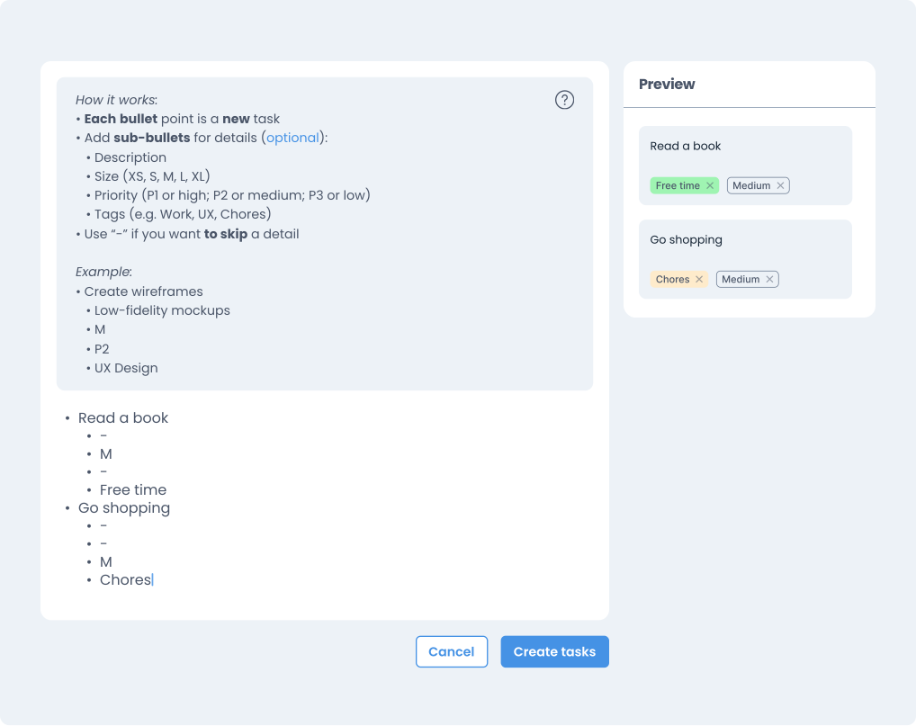
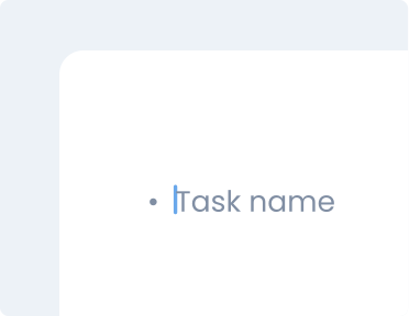
I also added placeholder text inside the writing area to show an example before someone started typing. It disappears once they begin, while the instructions remain available through the help icon.
This gave people three ways to understand the format: an example to start from, instructions to refer to, and a live preview of their task cards.
What the final experience looks like
The final design brings the writing area, optional instructions and live preview together. People can write several tasks in one place, check how their list translates into cards, and create them together when ready.
The feature is awaiting development, so its effect on task creation time and effort still needs testing.
What I'd test next
Creating several tasks together avoids repeating a separate form for each one, but introduces a writing format people need to learn. I’d test whether first-time users can create tasks, add optional details and correct formatting mistakes using the instructions and preview.
I’d also compare it with the standard form to understand when writing tasks together becomes useful and where it adds extra effort.