One designer, one engineer, zero budget and lots of passion for our craft.

This is the story of designing delight in a planning poker app as a side project. Not because the world desperately needed another one, but because we wanted to see what our version would look like.

Planning Poker - Hero Image

The tools work.
They just don't feel good.

Planning poker is already a solved problem in terms of function. Plenty of tools exist, and most of them get the job done. But spending time with them - and watching a real grooming session - made one thing obvious: these are tools people use, not tools people enjoy.

That gave us a different kind of design goal. Not "make it work better." Make it feel better - without making it bigger.

Doodle of a web browser

The constraint that guided the project

Early on, we set a constraint that became the filter for every decision that followed:

Anything we added had to be optional, lightweight, and invisible to anyone who didn’t want it.

No extra clicks in the core flow. No features that slowed down voting. No personality that got in the way of estimation.

This mattered because delight can easily become decoration. Or worse, distraction. So the challenge was not simply to make the app more fun. It was to make the experience feel more human while keeping the core flow as fast and focused as possible.

So we asked: what would it look like to add delight without adding complexity?

Doodle of a joyful girl

What we chose not to build

One tempting direction was to make the product feel more “complete”: add ticket management, story descriptions, backlog-like lists, advanced room settings, or more host controls.

But watching a real remote grooming session changed how I thought about the room. The team was already discussing the ticket live. The context was in the conversation, not on the planning poker screen.

So we kept the core product intentionally small.
Create a room.
Share a link.
Join quickly.
Vote clearly.
Reveal together.

The delight had to live around that flow, not inside its way.

Doodle of a handshake

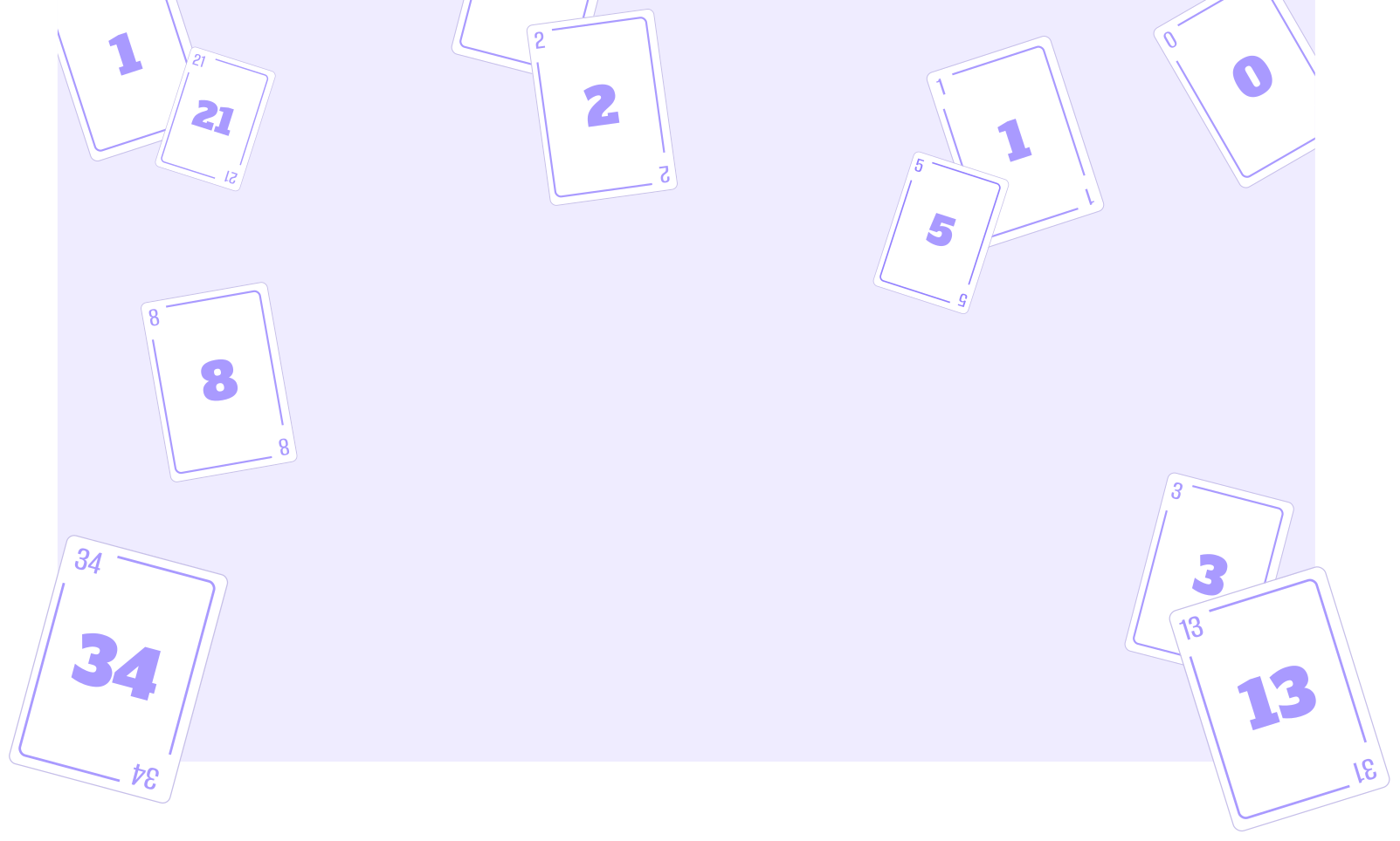
The cards are the obvious place to start

In most planning poker tools, you're clicking "5" or "8" on a plain card. It works, but it's forgettable. The cards are the one element every single participant touches in every single session and that makes them the highest-leverage surface for personality.

It’s optional, lightweight, and doesn’t change how planning poker fundamentally works. If you want the clean standard deck, nothing changes. But if your team wants the session to feel a little more playful, the product gives you a way to do that.

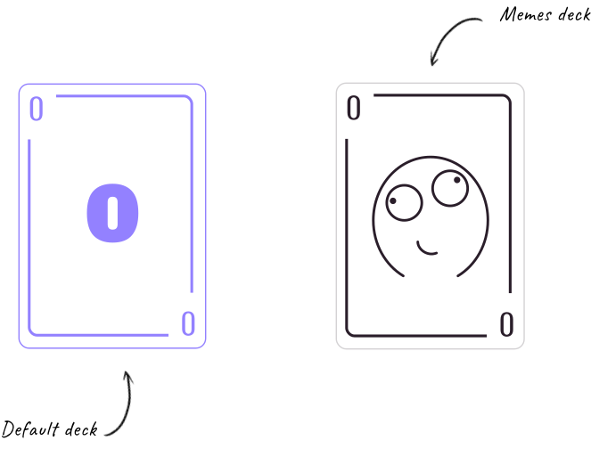
The default is clean and standard. For the MVP, we’re starting with one alternative: a meme deck.

Planning poker deck visuals

Why memes?

Meme culture runs deep in tech communities - especially among the younger, remote-first teams most likely to use a tool like this. It's a shared language that already exists in the room. We're just giving it a surface to show up on.

Insights from research on memes
Image of information pill element

Everyone knows what's happening at all times

One of the most frustrating moments in any collaborative tool is not knowing what you're supposed to do next. Has everyone voted? Are we waiting on someone? Should I do something?

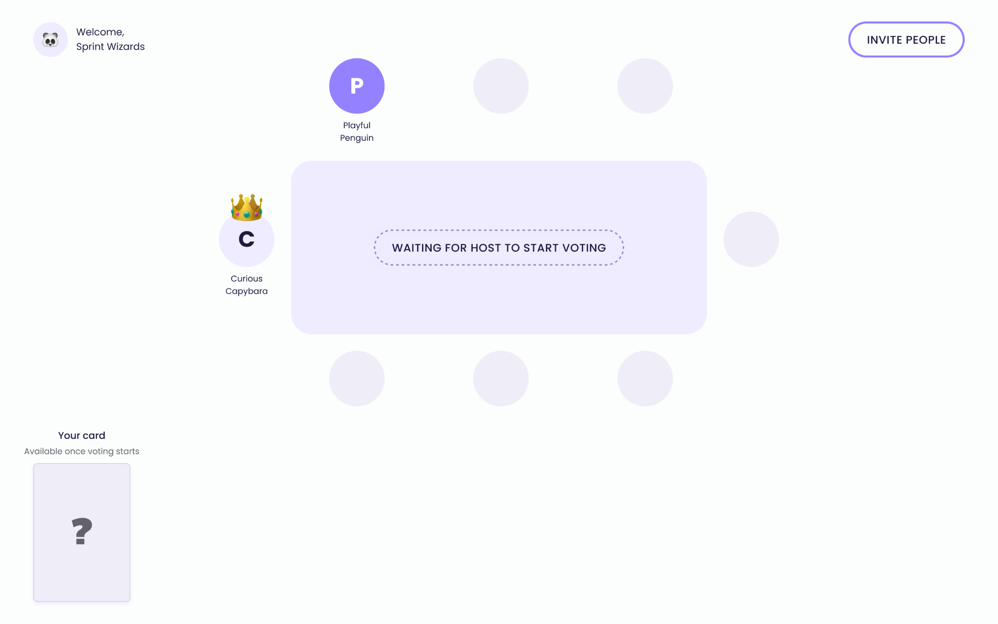
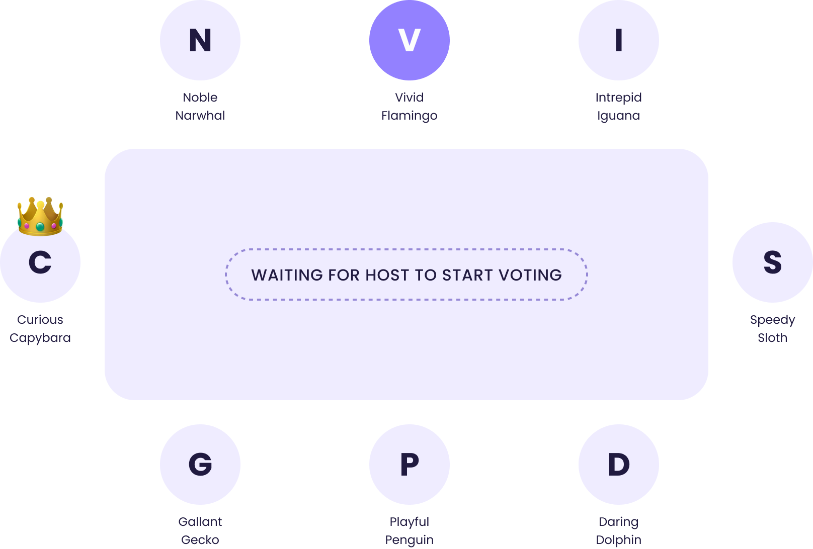
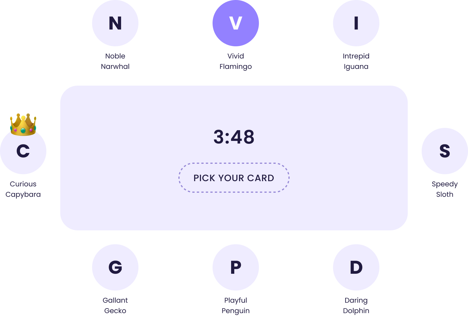
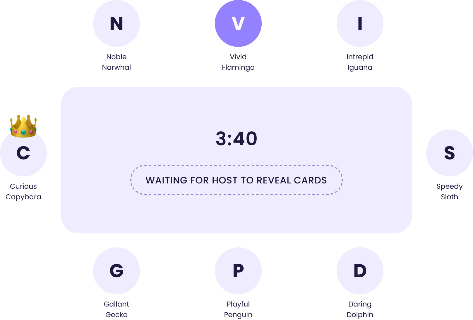
To prevent that uncertainty, I designed an information pill that sits at the center of the table. It shows the current state of the session in plain language - what's happening, what's needed, what comes next. The interface should answer that before the question appears.

The voting table with the pill in the center

Image of the voting table design

Who voted and what they voted

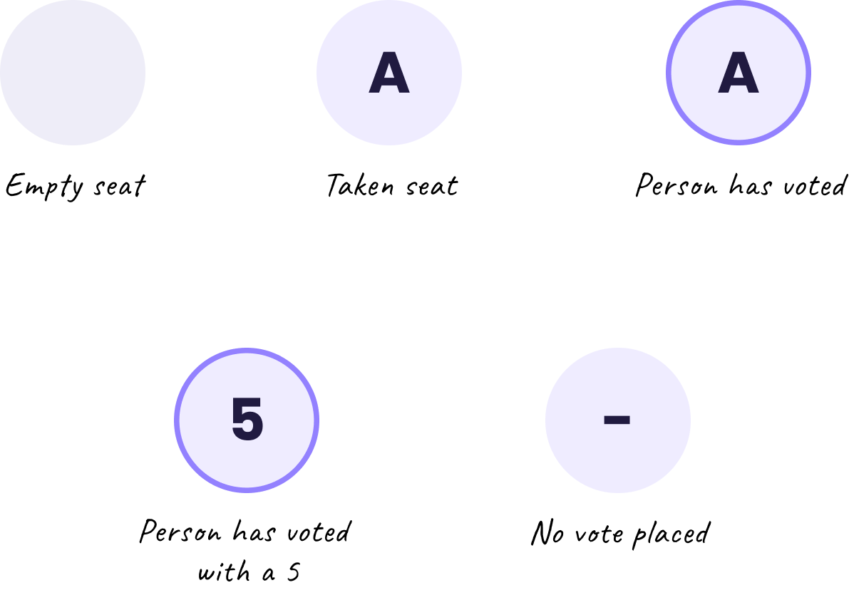
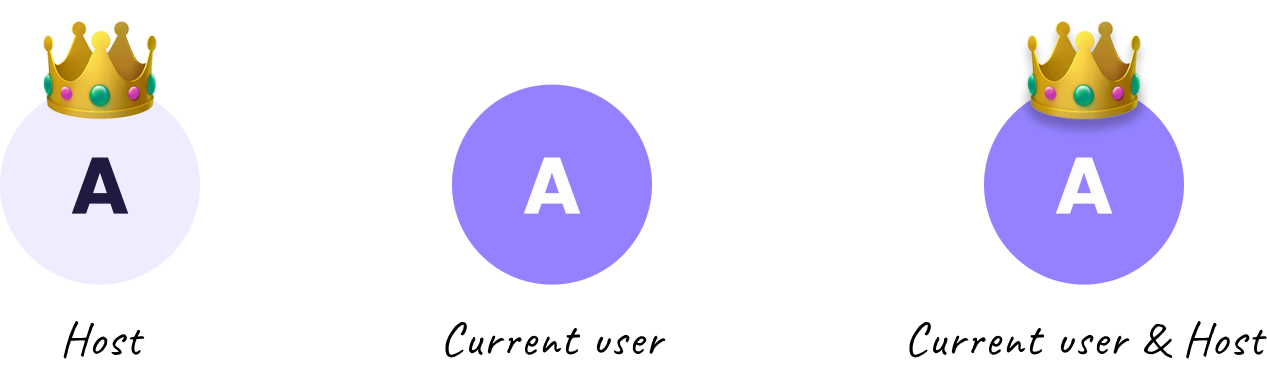
The pill tells you the state of the room. The avatars tell you the state of each person. I designed different avatar states that are visible to everyone throughout the session, so at a glance, you can see who's voted, who hasn't, and what they chose once the reveal happens without needing to ask.

Avatar variants visualisation

Small moments that feel alive

Planning poker is mostly waiting - waiting for others to vote, waiting for the reveal, waiting to start the next round. I wanted those moments to feel smooth and intentional, bringing joy to the user.

So I focused on small, contained microinteractions that acknowledge progress and make the room feel responsive.

Teammate placed their vote

When a person has confirmed their choice of card, a border appears around their avatar in a circular motion.

The reveal flip

When the host reveals votes, each avatar flips to show the number on the back. It's a small detail, but it mimics the physical act of turning over a card.

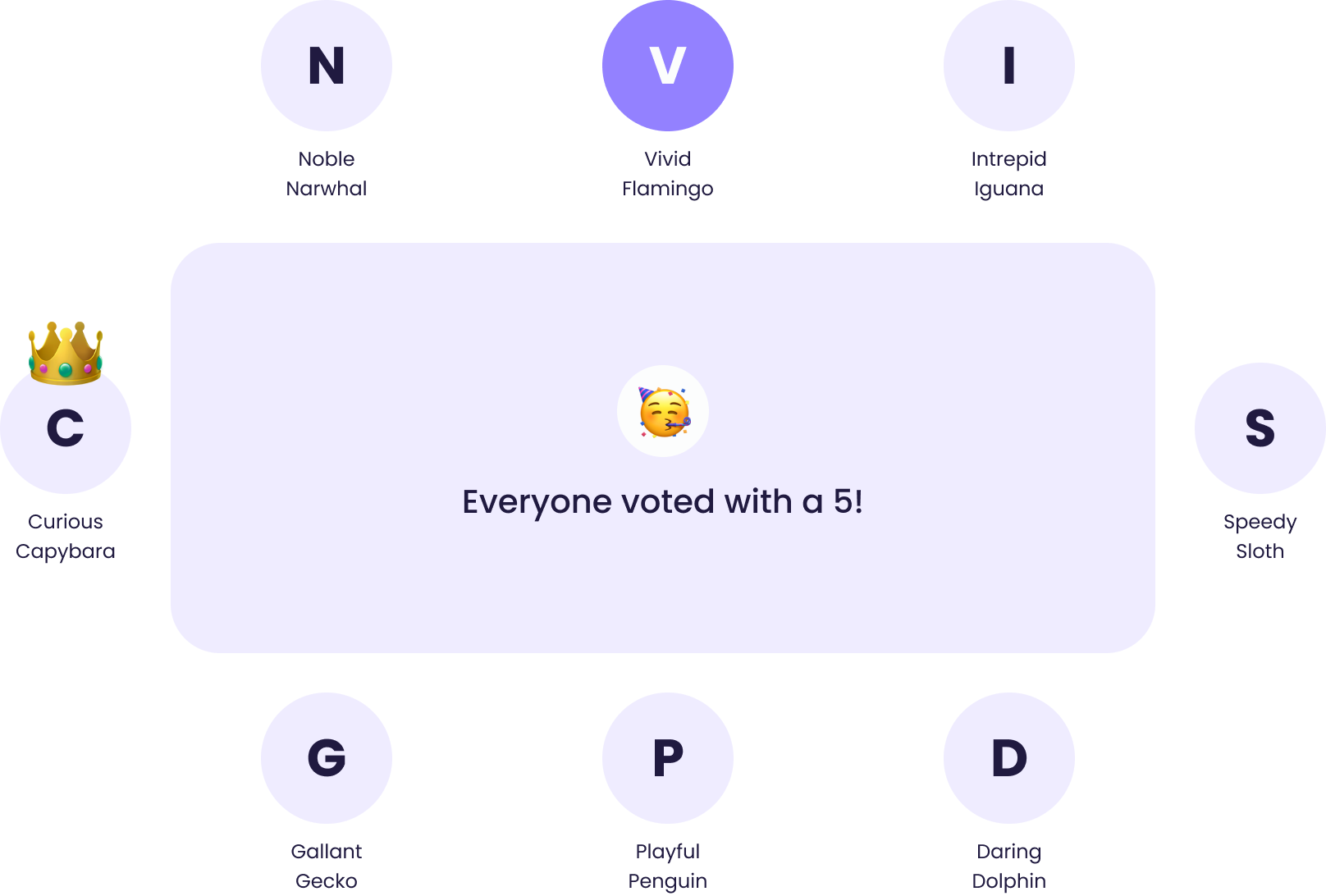
When everyone agrees - we celebrate

Consensus in planning poker is rare enough to feel like a small win. When everyone votes the same number, confetti bursts across the screen. It lasts about two seconds and disappears on its own - just a moment of acknowledgment and then you move on.

Fast to start. Fun to use.

None of these details change what planning poker is. The game works the same with or without meme decks, animated borders, or confetti. But they change how it feels - and in a tool people use every sprint, that matters more than it might seem.

The constraint we set at the start held through to the end: every delight moment is optional, subtle, and costs nothing if you don't want it. The session still starts in seconds, no sign-up required, and the core flow hasn't gained a single extra step.

A short video demonstrating the user flow for creating a new room

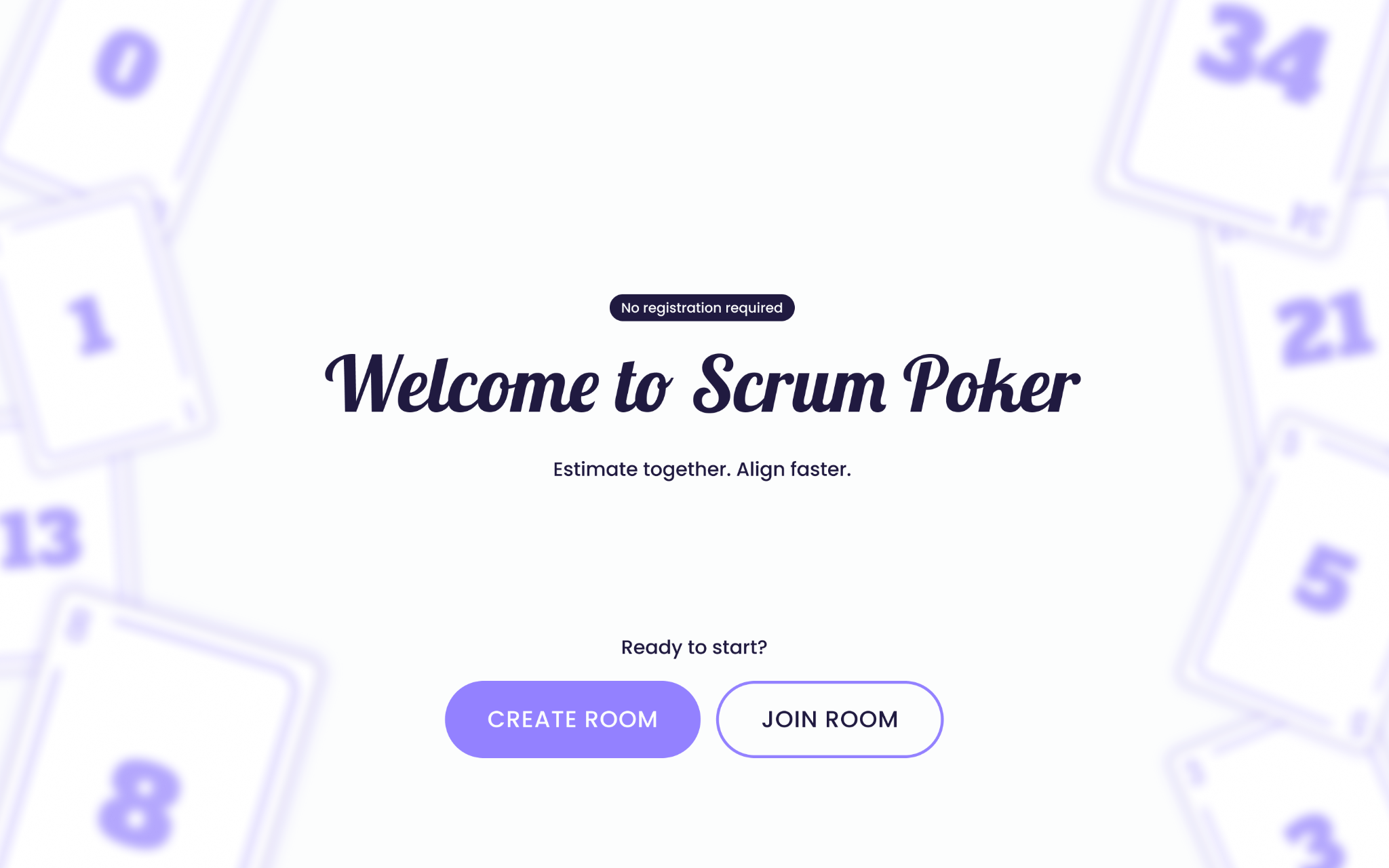
Main page of the planning poker web app